Brand Identity · Logotype · Full Guidelines
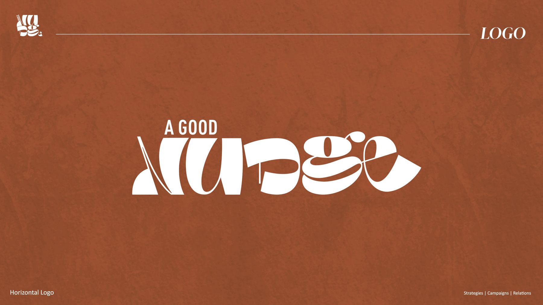
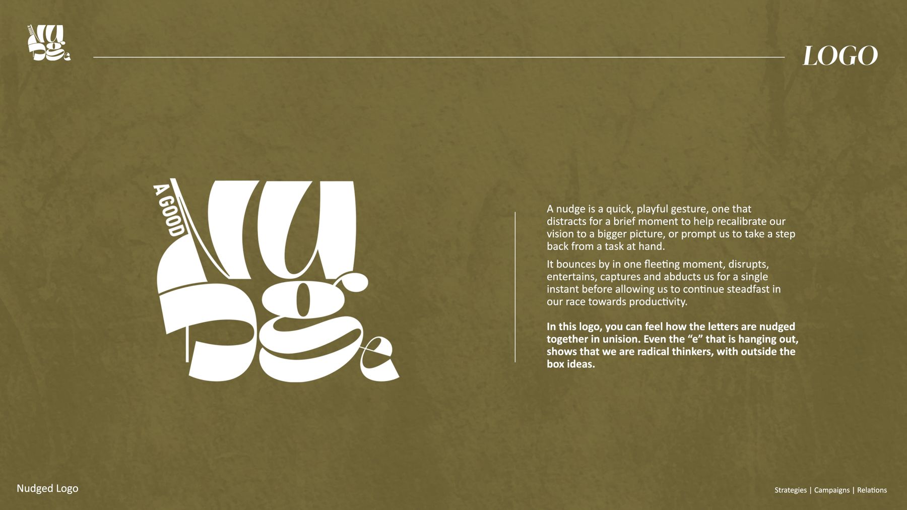
A marketing & brand agency needed an identity as playful as its name. The answer: a logotype where the letters literally nudge each other, leaning, bumping and huddling together, wrapped in a warm, editorial palette and documented in a complete branding guideline system.
[ 01 ]
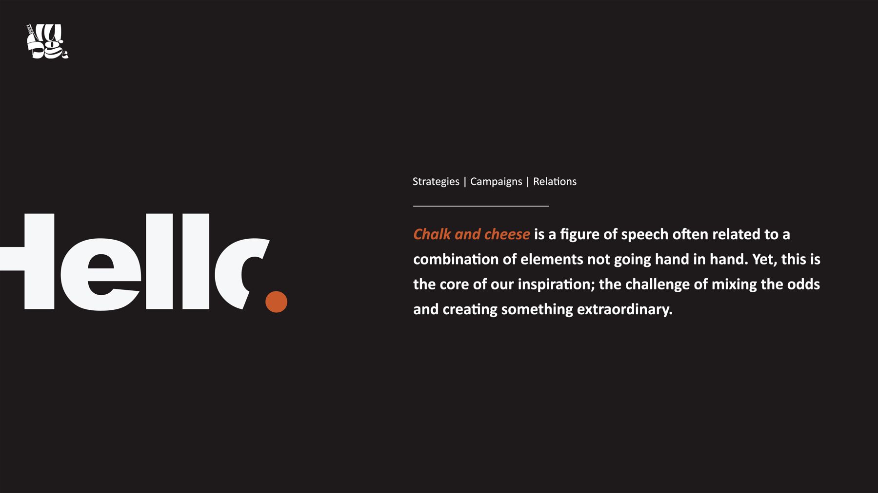
Chalk and cheese, elements that shouldn't go together, made to work together. That tension became the core of the brand: letterforms nudged out of line on purpose, radical thinking outside the box, and a voice that stays fun and human.


[ 02 ]
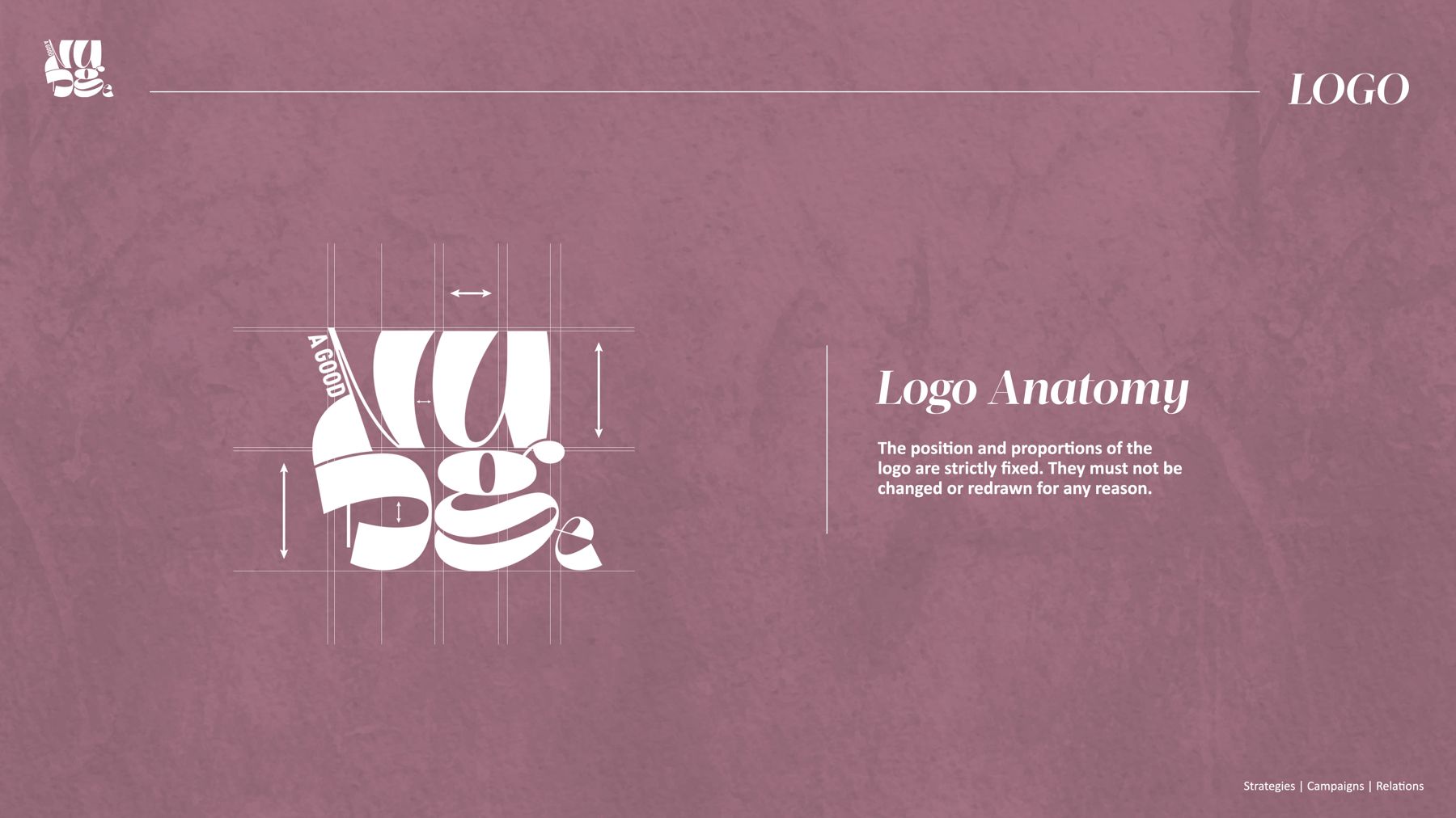
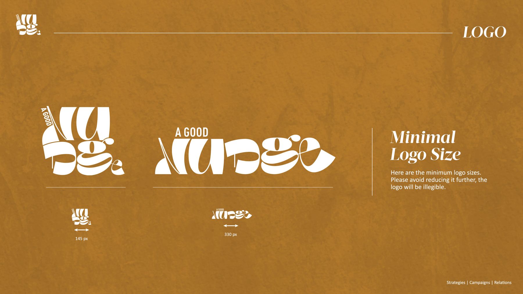
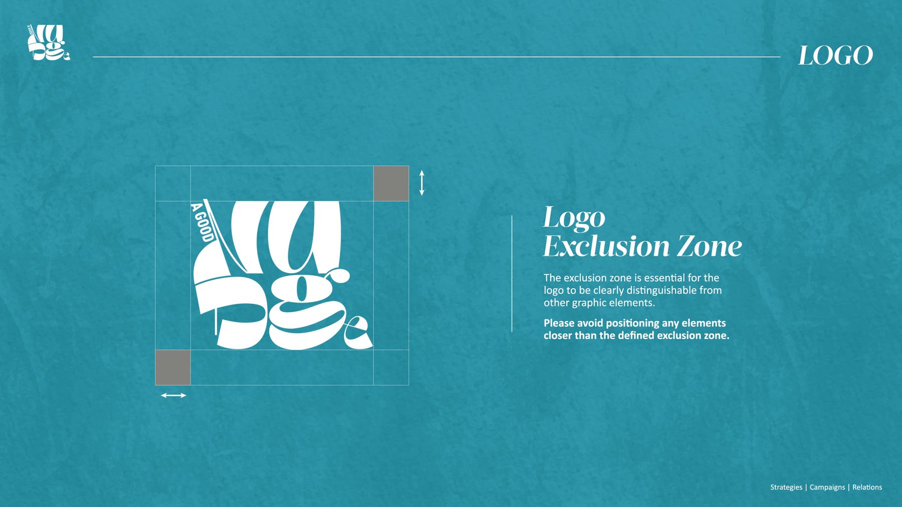
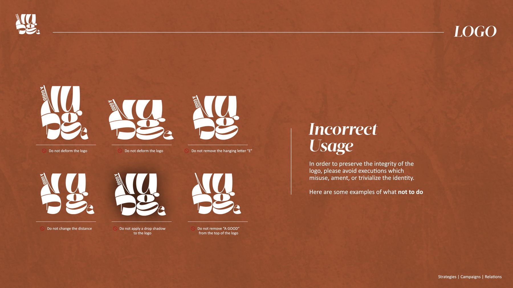
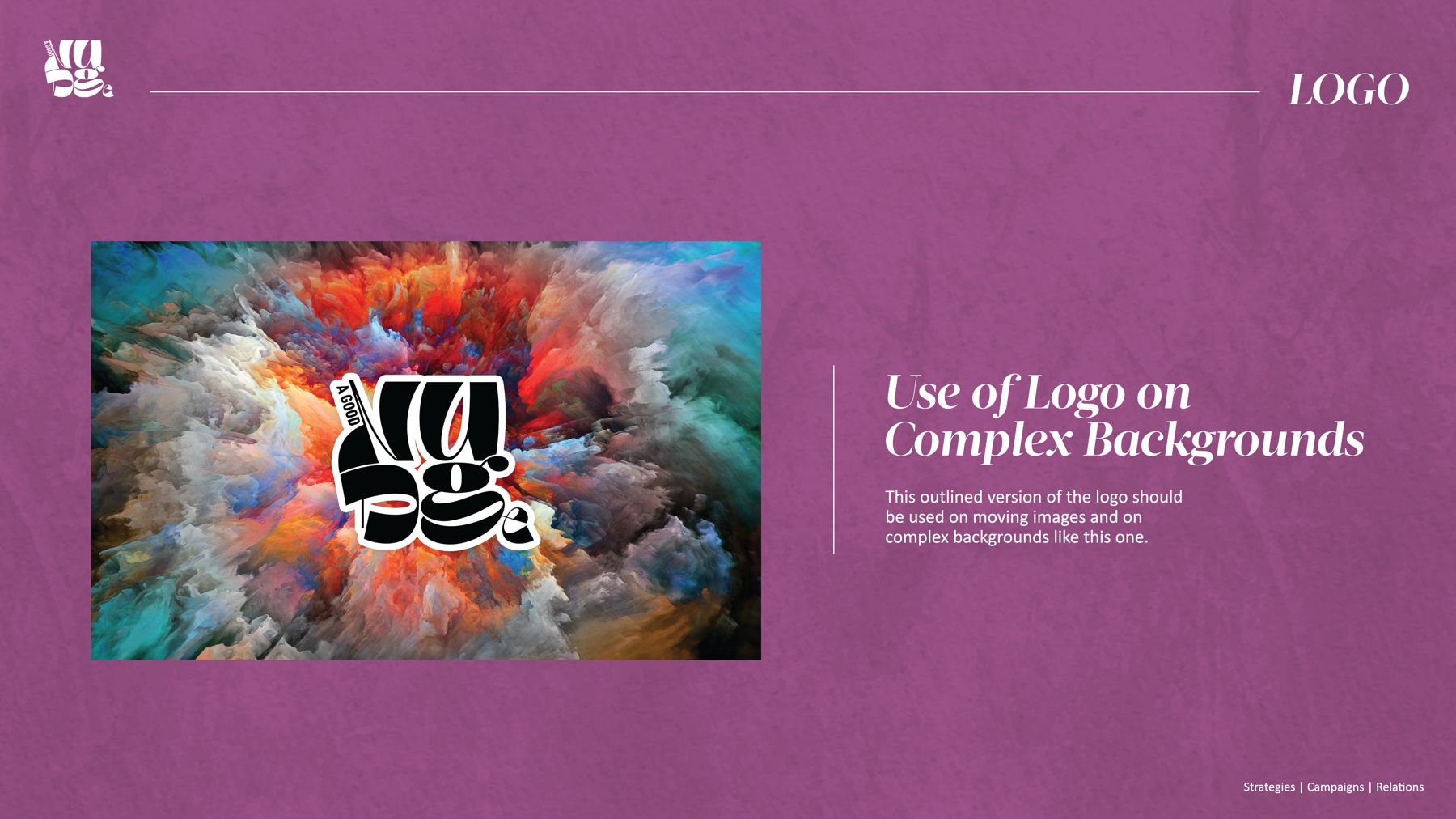
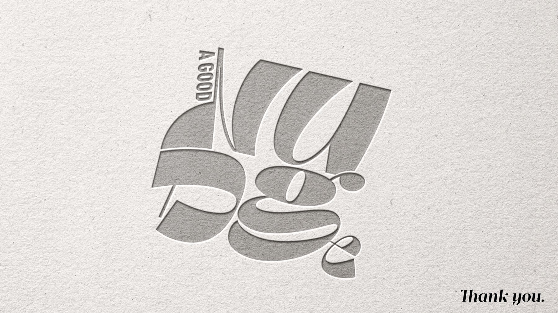
Every letter is mid-nudge: tilted, tucked and stacked so the wordmark reads as a friendly crowd rather than a row of type. The system is fully specified, anatomy, minimum sizes, exclusion zones, misuse rules and behaviour on complex backgrounds.


[ 03 ]
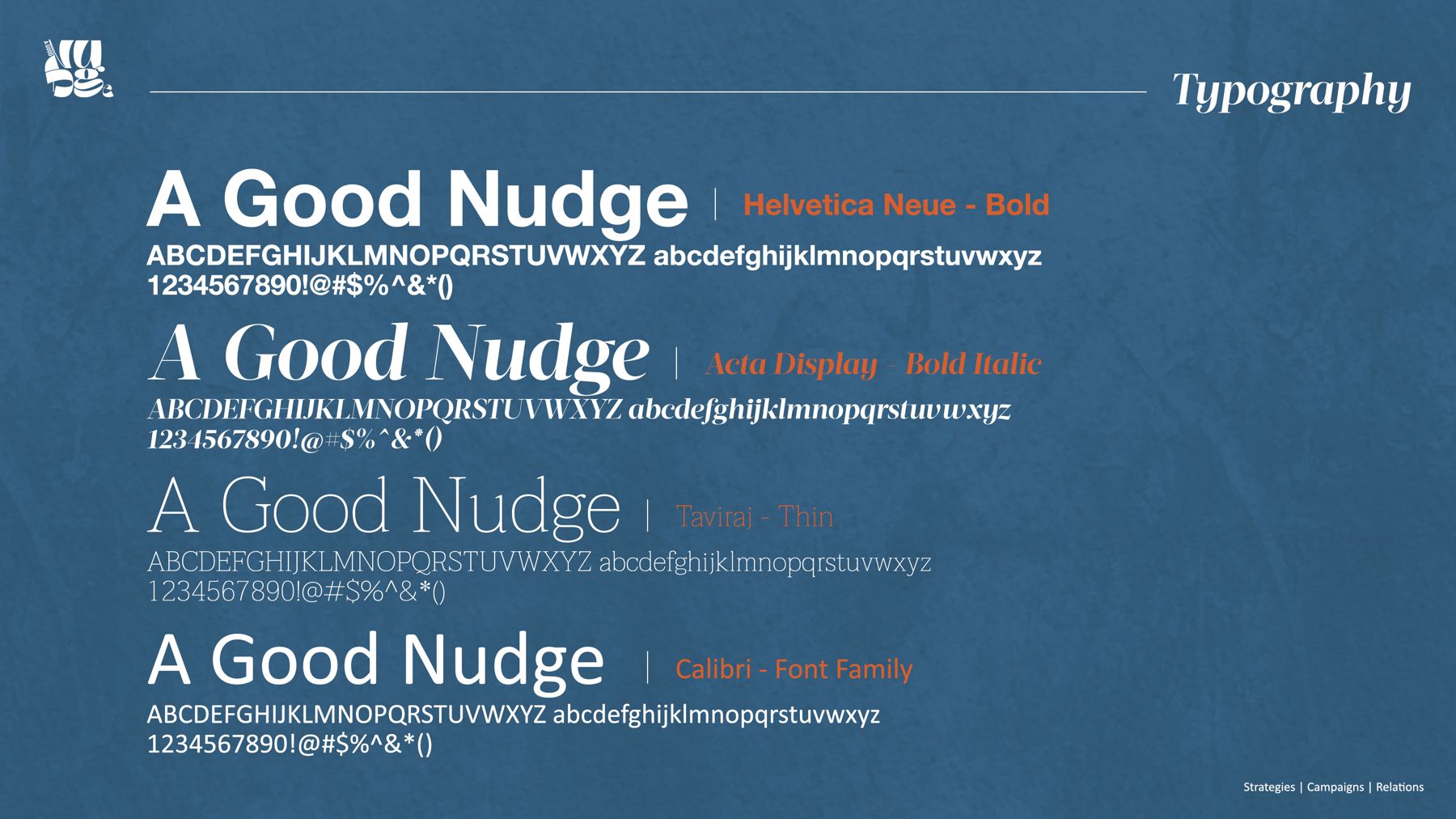
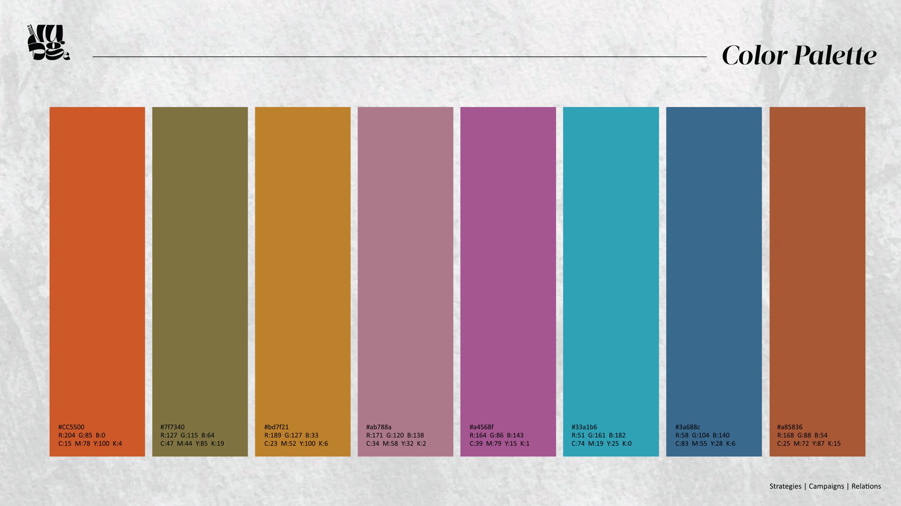
Helvetica Neue carries the headlines, Seto Display adds the wink, and a warm six-colour palette, rust, olive, mustard, mauve, teal and steel blue, keeps every layout feeling editorial and a little unexpected.


[ 04 ]
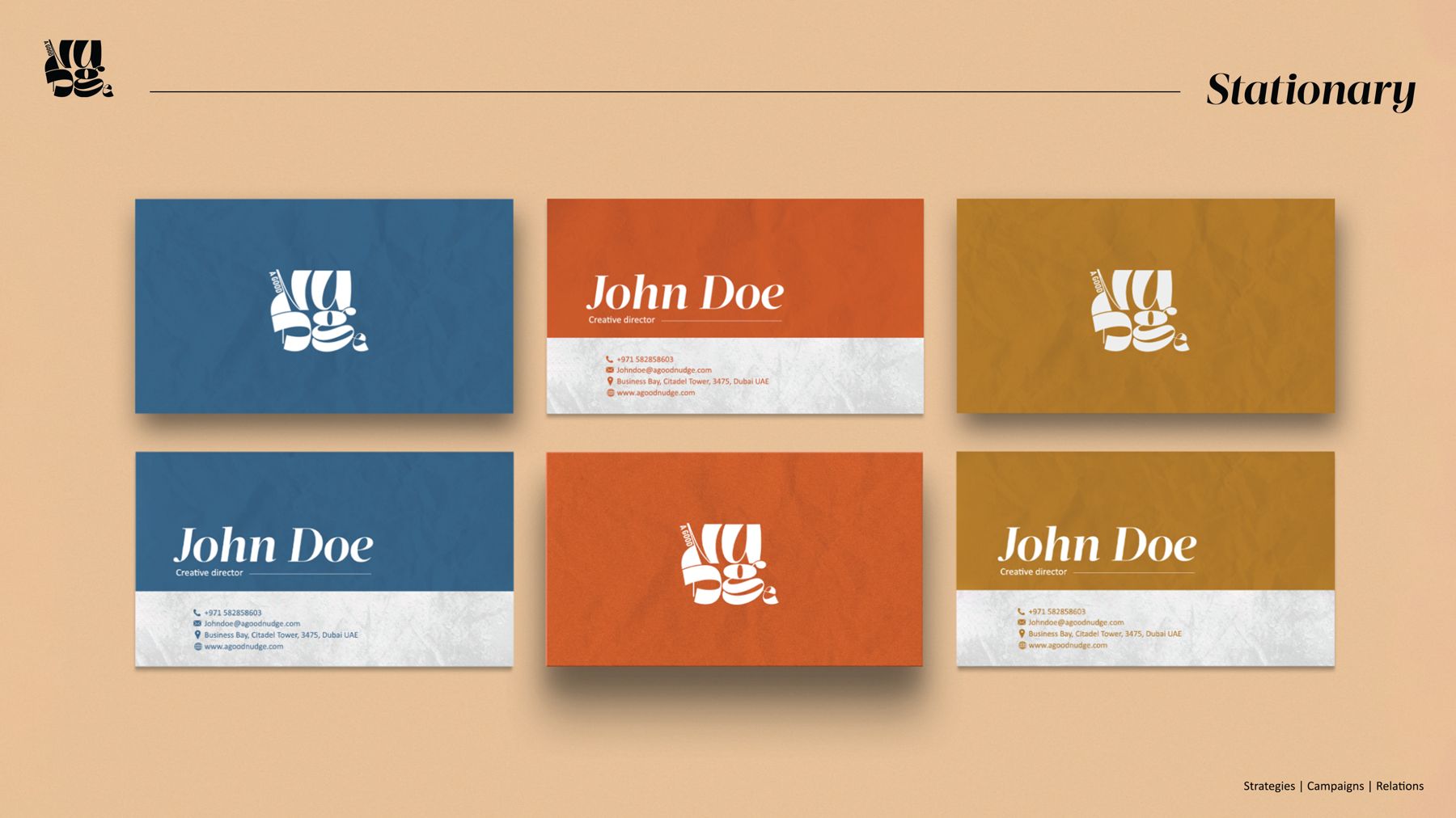
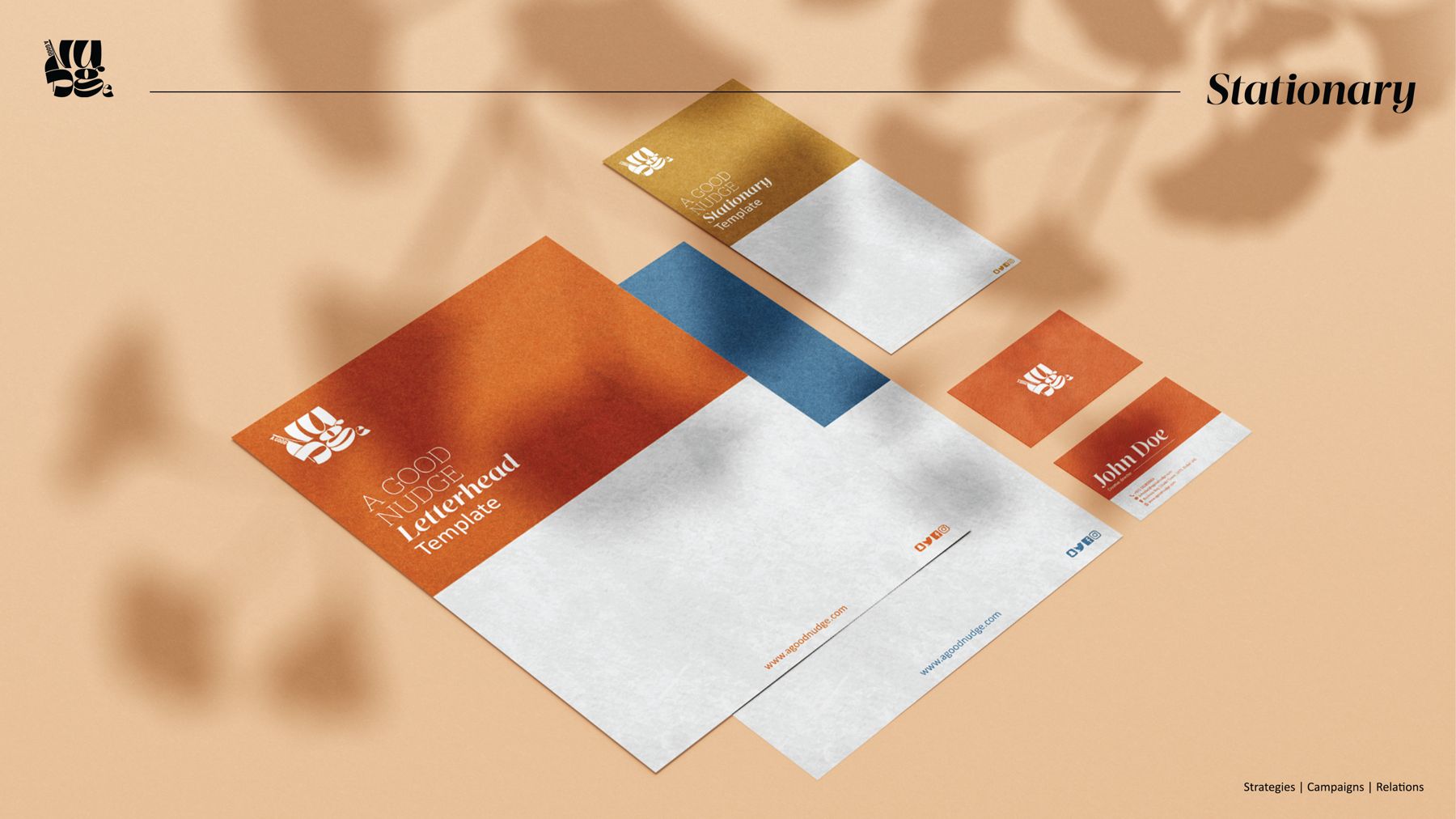
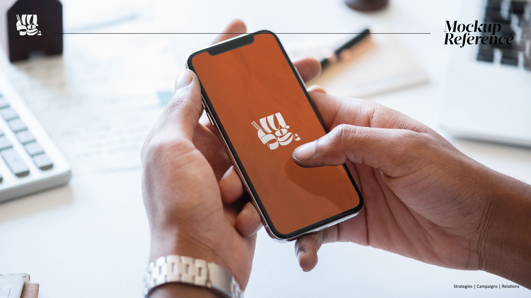
The identity applied across stationery, print and screen, business cards, letterheads and the brand living on a phone. Tap any image to view it full size.