Pandemic Polly Peppers.
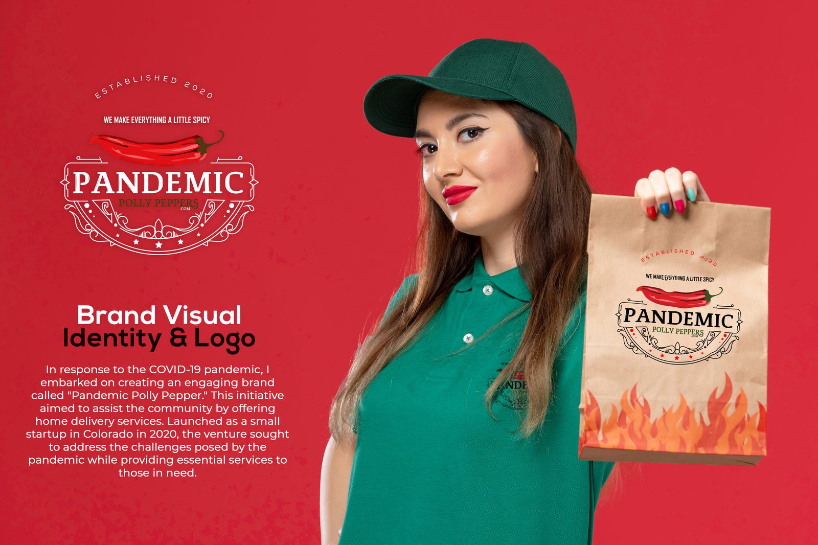
A complete brand visual identity and logo system for a Colorado spicy-sauce delivery startup — a vintage crest, a bold wordmark and a full applied identity from bag to polo.
The brief.
In response to the COVID-19 pandemic, Pandemic Polly Peppers launched as a small Colorado startup offering home delivery of spicy sauces and jams. The identity needed to feel warm and characterful — a little playful, a little heritage — under the line “we make everything a little spicy.”
Logo system.
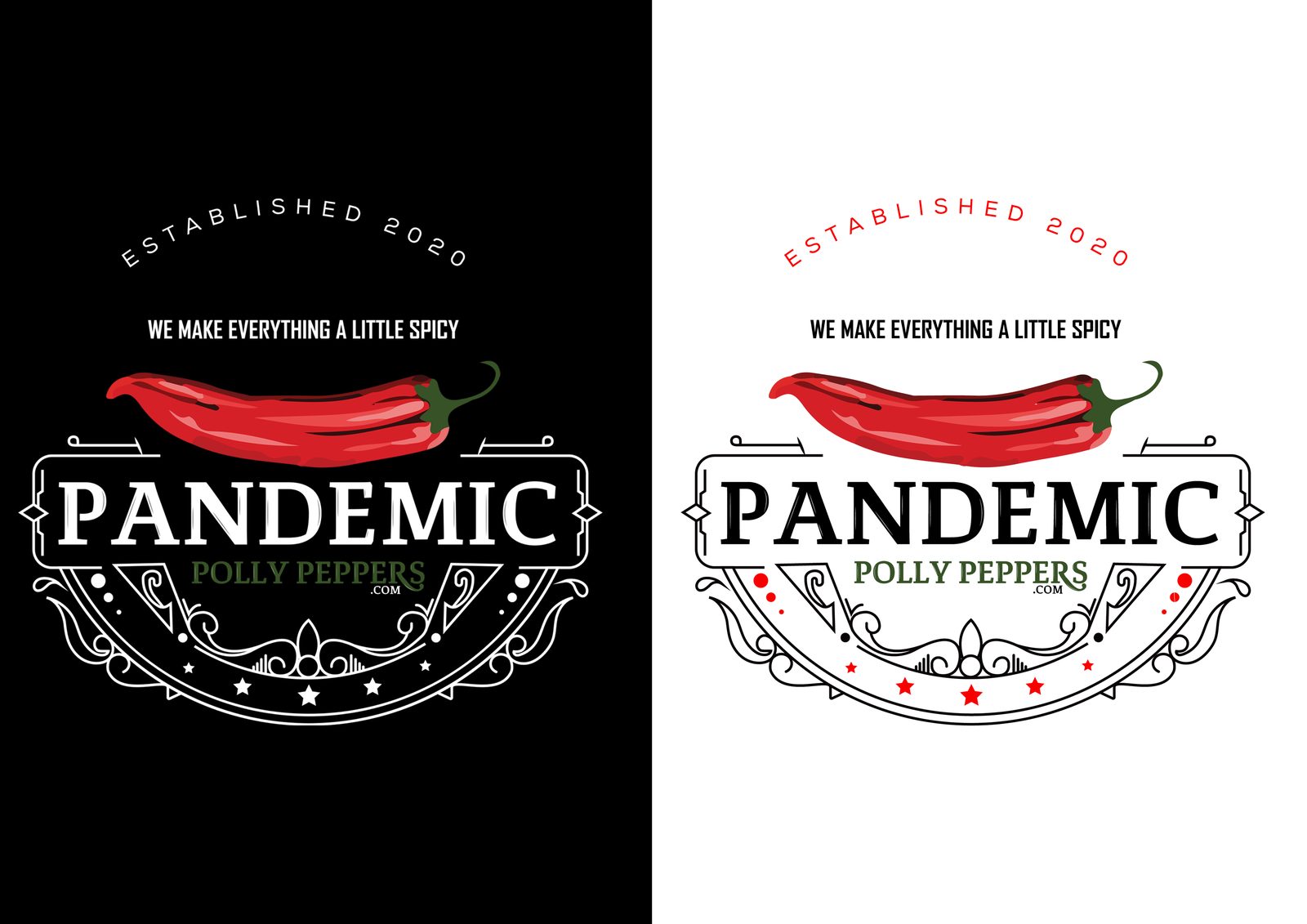
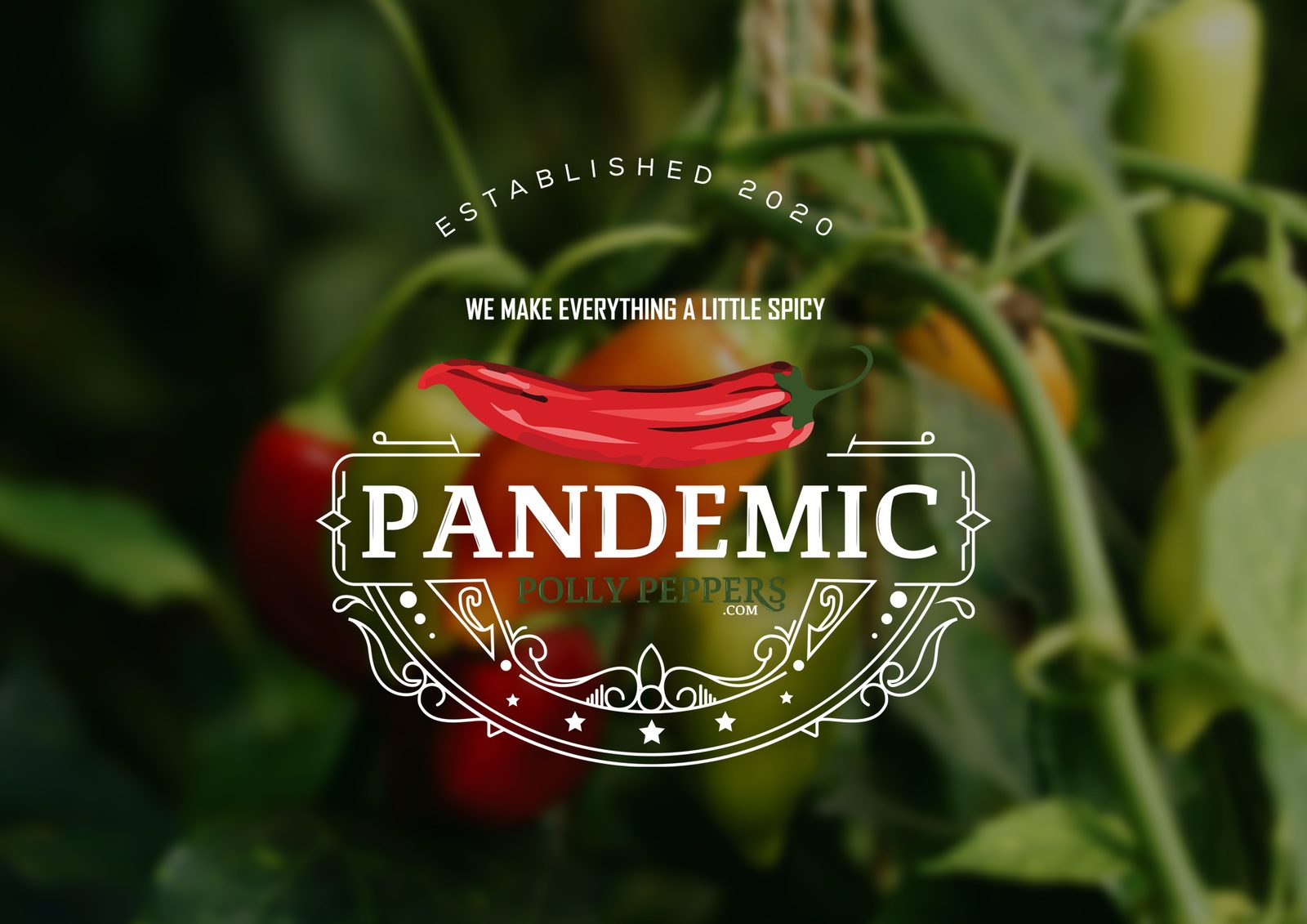
A vintage-style crest pairs a hand-illustrated chilli with an ornamental frame and a strong serif wordmark. It’s built to hold up in a single colour, so it reads cleanly on a paper bag, a shirt or a jar lid.
Colour palette.
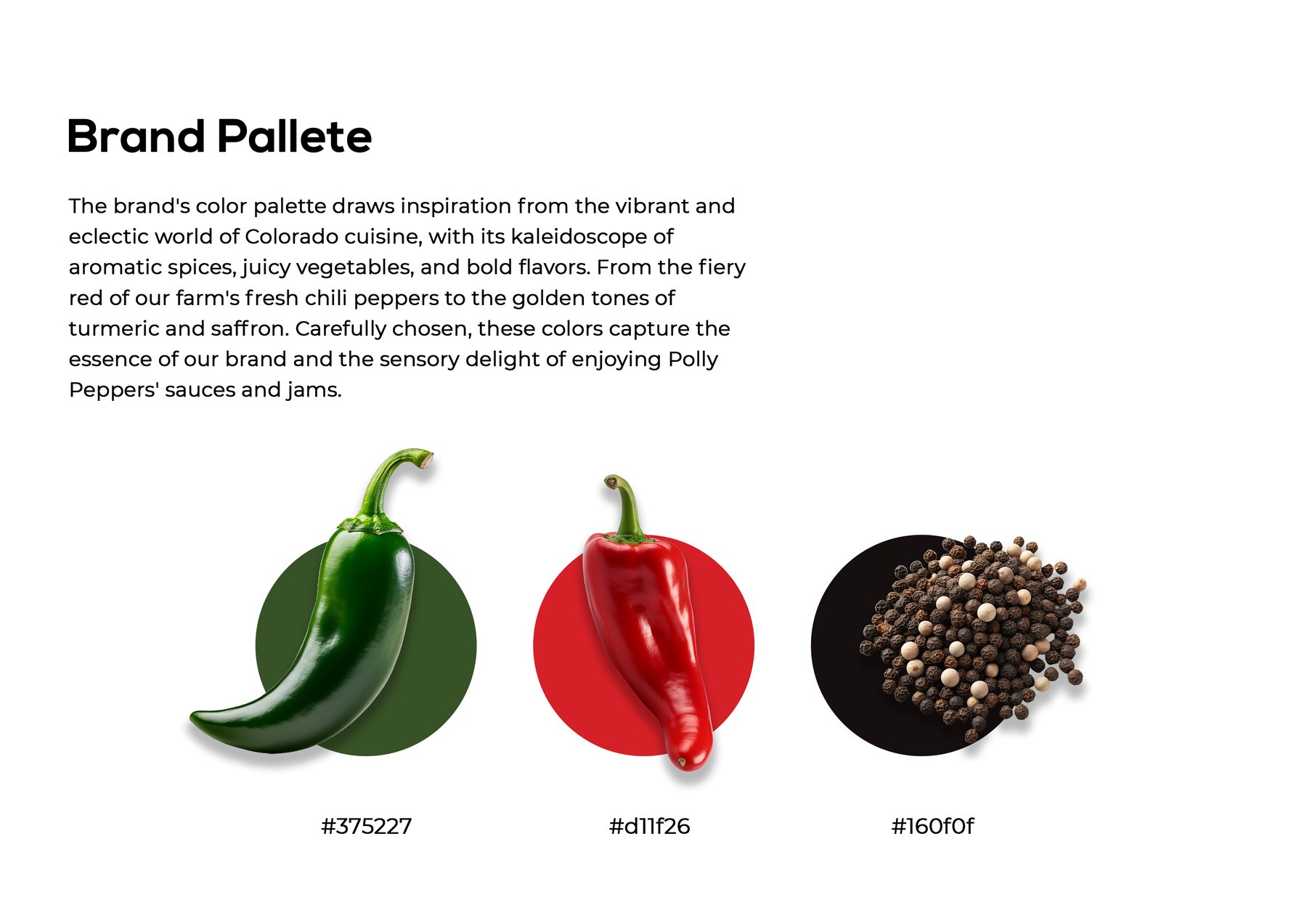
The palette draws on Colorado cuisine — the fiery red of fresh chilli, the deep green of the pepper leaf and a near-black for grounding and contrast.